Five Simple Tips to Make Great Diptics
26 Jun 2013
No matter if you’re new to Diptic or the next Michelangelo of iPhoneography, it’s smart to remember the basics. As such, we’ve compiled five easy-to-use tips to help you make Diptics that look great every time!
- Start with a classic layout, such as the layout with two frames stacked horizontally or the one with two frames stacked vertically.
- Add an image that looks good on its own (Diptic is awesome, but it can’t fix a bad photo!).
- Add a second image that complements the first image. This is the key to making a great Diptic, no matter what layout you use. Here are a few ways you can pick images that look good together:
Use images with complementary or similar colors.

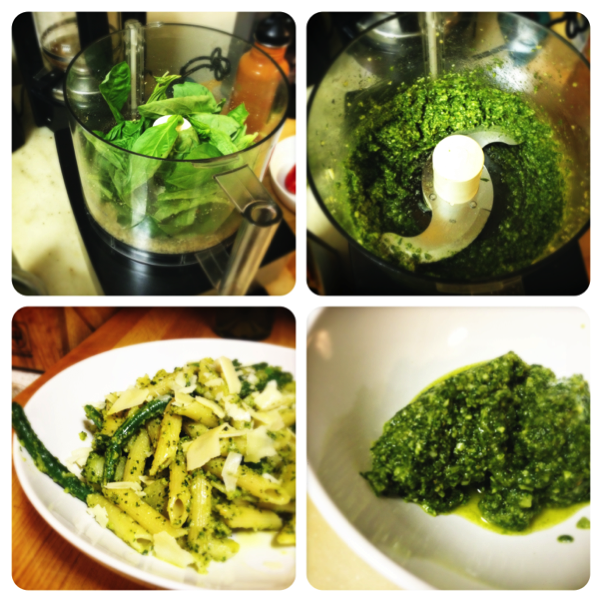
Use images that highlight different aspects of a particular item or theme (parts of an outfit, ingredients in a recipe, etc.).

Select images that illustrate a sequence of events.

Use the same photo in both frames, but tweak one of the images to make it a little different (adjust color, apply a filter, etc.).

- Keep the border basic (or none).
- Go easy on the filters. A filter should generally be used to enhance your image, not be a focal point in your Diptic.
Do you have any tips or techniques you use when creating Diptics? Let us know via email, Facebook or Twitter!
Happy Diptic’ing!
Diptic Blog
- Diptic Super 8
- Diptic's iOS 8 Photo Extension
- Diptic is Now Optimized for iOS 8
- What happened to my Camera Roll? Where are my photos?
- Importing Photos on Diptic for iPhone
- Introducing Diptic 7.0
- Diptic is now Available on Windows 8.1
- Diptic Video: 50 Percent Off For a Limited Time
- Introducing Diptic Video 1.1 (Now With Slow Motion)
- Diptic Pro Tip #7: Printing your Diptics
- Diptic for Android is now Part of Google Play for Education
- Diptic for Mac: Best of 2013
- Diptic PDQ: Best of 2013
- Diptic for Windows Phone 8 Now Supports Low-Memory Devices
- Introducing Diptic Video: Make Moving Picture Masterpieces
- Diptic is Now Available On Windows Phone 8
- Diptic for Mac 2.0
- Diptic Technical Tutorials by the App Whisperer
- Diptic PDQ Giveaway
- Q&A: Diptic Vs. Diptic PDQ
- Introducing Diptic PDQ: Powerful Designs… Quickly (aka: Pretty Dang Quick)
- Diptic is Now on Amazon!
- All Things Text
- Diptic for Android Update
- Diptic Pro Tip #6: Select Multiple Photos At Once
- Five Simple Tips to Make Great Diptics
- Diptic at the WWDC
- Diptic for Instagram
- Tutorial: Using Diptic and Layover to Create a Composite Image
- Diptic Pro Tip #5: Selecting A Background Color
- Diptic Pro Tip #4: One Image, Two Filters
- Introducing Diptic 6.3
- Introducing Diptic 6.2
- App Stacking
- Diptic Pro Tip #3: Starting Over
- Diptic Pro Tip #2: Breaking the Frame
- Introducing Diptic 6.1
- Diptic Pro Tip #1: Swapping Photos
- #ShowMeYourDiptic Contest Winners
- Introducing Diptic 6: Our Biggest Update Ever
- Mac App Store â Best of 2012
- Show Me Your Diptic Contest
- Announcing the Layover & Diptic Contest Winner
- iOS 6 Privacy Changes
- Diptic is iPhone 5 Ready
- Layover & Diptic Contest
- LA Mobile Arts Festival 2012 Takes Off With Diptic On Board
- Introducing Layover, A New Photo Blending App
- Show My Style Contest
- My Favorite Diptic Contest Winner
- Diptic is the App Store App of the Week
- My Favorite Diptic Contest
- Look Like a Photo Genius With Diptic for Mac
- Tell the Story Contest Winner
- Diptic 5.5: Filters, iPad Retina Display and More!
- Diptic Wins Best Photography Mobile App in 2012 MobileWebAwards
- Tell The Story Contest
- One Million Questions For One Million Downloadsâ¦Well, Just Six Questions
- Diptic Version 5: User Experience and Interface Updates
- Diptic 5! More Layouts, More Features, More Fun!
- Diptic: One Image, Multiple Effects
- Video Demo by AdoramaTV
- Hi, I'm this many! [holds three fingers up]
- twitter background
